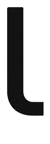



Core identity
always presentThe foundation of every surface. Primary Black carries all text, primary buttons and dark blocks. Paper and Warm are the canvas. The Silver Gradient is the signature, living in the q of the wordmark, in large hero moments and in the ambience, never in small functional elements.
Coral, the living thread
under 2% of any screenOne warm accent against a cool world. Coral marks what is happening right now: live activity, pulses, small counters, the home city. It works because it is scarce. The moment coral appears on a button or a large surface, it stops meaning anything.
Coral yes use
- Pulsing live indicators and activity dots
- Mesh pulses traveling between the three seats
- Tiny numerals: 01 02 03, fit percentages, counters
- 18px kicker dashes and eyebrow lines
- The home marker, Madrid, on the map
Coral never avoid
- Buttons or calls to action of any size
- Backgrounds, cards or section fills
- Headlines or body text
- Anything larger than a fingertip
The three seats
derived from imageryEach audience owns a blue, sampled directly from its header imagery so card and cover always belong to the same world. Use the main tone for identity in glows, kickers and tiles, the deep tone for text on light backgrounds, and the tint for chip and row backgrounds.
If header imagery changes, re-sample the palette from the new image. Take the dark tone at the 10th luminance percentile for the main color, then darken it around 20% for the text tone. The rule is the method, not the hex.
Data visualization blues
room sectionsSix distinguishable tones from one cold family, used for the data room sections and any categorical data. All support white marks on top. When more categories are needed, interpolate within this range and never introduce a warm hue.
Proportion
how much of whatA Linqn screen is mostly quiet. The bar below is drawn to the exact percentages it describes, so the coral sliver at the far right is the real size coral is allowed to be.
Contrast pairs
WCAG AAEvery pairing below is approved for production. Anything outside this table needs a ratio check before it ships.
| Use | Pair | Demo |
|---|---|---|
| Body text | #16181D on #FFFFFF · 16.5:1 | Three seats, one field. |
| Buttons | #FFFFFF on #16181D · 16.5:1 | Open data room |
| Seat text on white | deep tones only · #2E505C, #45707E, #4A5F8C | VC · Seed |
| Coral numerals | #E05A45 on #FFFFFF · 11px and up, semibold | 98% fit |
| White on seat mains | safe on #38616F, #4F7E8D, #637BA6 and darker | start up |
| Never | #84ABB8 or the silver gradient as text on white | unreadablefails AA |
Global rules
non negotiableThese hold across product, marketing, decks and social. A change to any of them is a change to the brand, not a local exception.
Always do
- Cool family only: every hue between blue and teal, plus the single coral
- Sample audience colors from their real imagery
- Duotone photography into the palette before use
- Hairlines at rgba(22,24,29,0.07–0.12), never solid gray borders
- Colored glows carry each card's own color
Never avoid
- Green, yellow, amber, violet or magenta anywhere
- Coral on buttons, fills or anything large
- Silver gradient on small elements over white
- Full saturation photography without duotone treatment
- More than one warm element visible per viewport
This page breaks the last rule on purpose. It is the only surface in the system that shows the whole palette at once, and product screens never do.